
Mobile App Redesign - TV Time
This case study summarizes the mobile application redesign of TV Time, a popular television and movie tracking app with millions of users.
Problem Solving & Competitor Analysis


Every single problem needs to be addressed differently, since no problem is the same, even if one or more falls under the same umbrella. For example, as a designer, I was presented with the task of redesigning an application that has a poor interface and interaction design and researching how to improve certain aspects of the product.
This is based on competitors in the industry as well as discovering the intended and desired audiences that will benefit most from the application itself and the redesign of the interface and overall visual design.
The app that I chose to improve was one I was already familiar with because of years of utilizing its resources. I have used TV Time to keep track of my tv show viewing habits and discover forgotten shows from decades ago.
As an avid consumer of the application, I’m able to recognize and dissect the design issues I have faced as a user over the years.
Before diving off the deep end of the design process, a designer must complete valuable research to help them uncover what makes the application unfavorable to certain users as well as how competitors in the industry are interpreting this idea and making it successful or unsuccessful in their image.
Taking all these steps will allow me to create a reinvented model of the TV Time app with collected data and necessary analysis.
Research & Personas


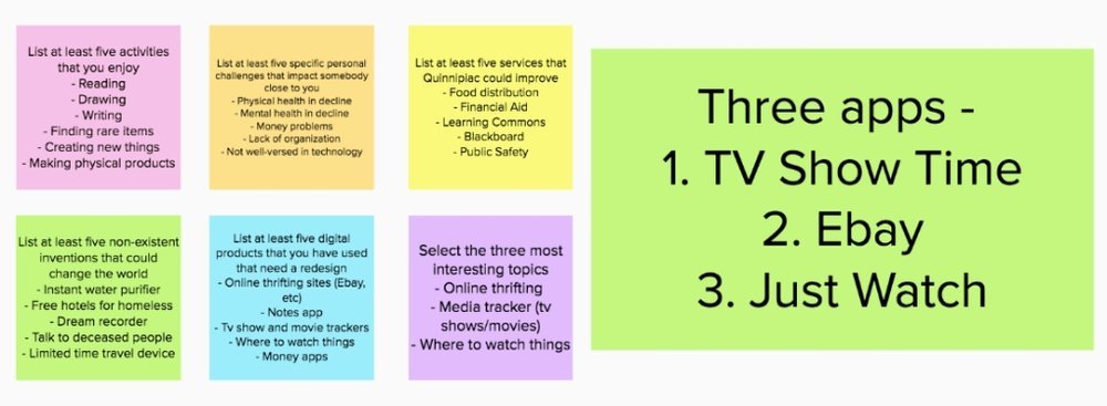
While on the path of ideation and product research, one must stop and think about who the intended people are to market towards and who will benefit most from the application and product design in general, including the field of user research and why it’s more important than ever to incorporate this specific method into your marketing research.
Getting to understand who your customers are and how your product will affect their lives, most likely in a positive light, is one of the most important aspects of the research process before finding consumers to examine your beta trials of the application or corresponding product.
At this point in the ideation and research process, I have decided which application I will be redesigning in a new and improved light. TV Time is a phone and tablet application that allows its users to track, react and sort their favorite tv shows and movies as well as share their data and submissions with their friends within the app community.
I have personally used this application over the years and have known many different people who took advantage of its features throughout their daily life.
With this in mind, I took the background knowledge I had acquired from my youth and personal experience as a user of the application and used it to imagine the potential users that will eventually be the consumers of the product and what they need from the interface design. In the industry, this process is called creating a persona.
I took the widespread data of users from teens to senior citizens and comprised them into three separate personas with details including their technological capabilities, location, goals for the application, and finally a day in their lives.
Brand Identity Redesign

In taking the next steps in reevaluating an established application is dissecting the brand identity specifically and how it ties the app altogether in unity or lack thereof.
When analyzing what needs to be changed, designers usually look at several items: the colors, UI style symbols, and buttons, typography, logotypes, and tone of voice throughout the application.
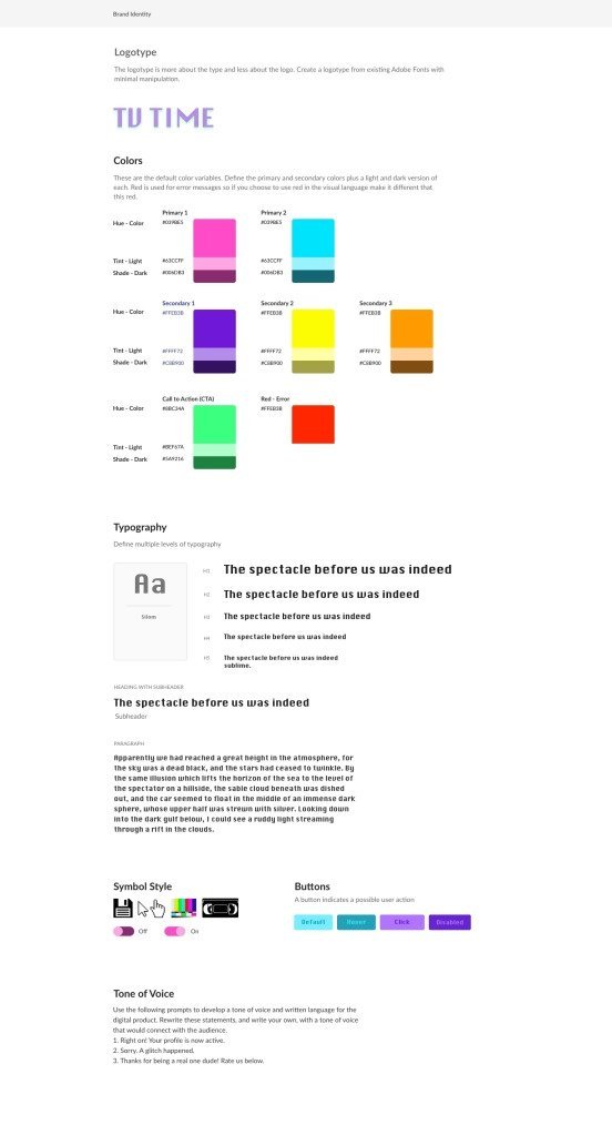
When redesigning the TV Time user interface, I experimented with three different designs or overall aesthetics. I wanted to step away from the dark and overwhelming color scheme of black and yellow and explore the many options that I was inspired by based on different eras in television. For the first branding redesign, I wanted users to feel like they were transported to a day in the 80s when they opened and began using the application.
There is no shortage of colors being considered for the color scheme because I took inspiration from the iconic tv glitch we all know and love, which represents many colors that are bright and eye-catching. The typeface chosen for this branding idea is called Silom, which is a more legible version of the classic glitchy typeface that has been recreated many times over the years.
I wanted to incorporate more glitchy elements through the type but didn’t want to compromise the legibility and message quality of the product, so I kept the glitch style elements within the UI symbols.
Compared to the other brand redesign concepts, the UI symbol style is intentionally a bit bulkier and bolder as well as keeping the edges and small pixelized elements to signify the era we’re trying to emulate with the application design. The tone of voice signals to this as well with the use of catchphrases and decade-correct verbiage to entice the user and bring them into the application to explore.
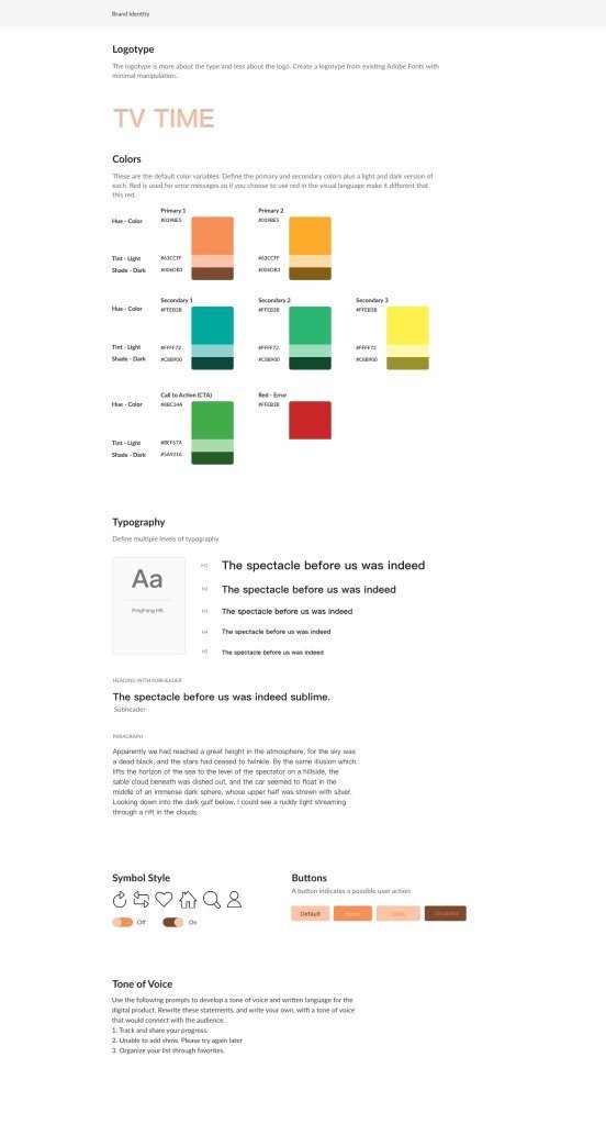
On the other end of the design spectrum, I wanted to emulate the popular mobile application designs of today’s age, the slim icons, the simple typefaces that are easily legible and look equally professional in most situations, mainly keeping to the safer route design-wise and not taking any risks while trying to create a new brand image.
I did want to take a step forward and choose bold and nonuniform colors to draw in the consumers with warm and cool colors that are rarely chosen to blend in unison. I often see cool colors such as blues, purples, and darker greens being used in UI/UX application development, and I wanted to take a piece of that and run with it to see if it could be successful within the parameters of my redesign and overall functionality of the app.
The tone being incorporated in this version of the brand identity redesign is similar to many applications on the market currently, regardless of what they’re promoting or what category they fit into. I wanted to keep the ton simple to let the users be able to focus on the content they want to log into the application and keep track of, as the original UI/UX design was intended to do.
In the final brand redesign, I had the idea to combine both ends of the design spectrum and allow them to blend to create an all-new concept in today’s application market. I wanted to shy away from popular typefaces and incorporate a more rounded design, such as the All-Round Gothic, into the design to allow some users to feel a sense of familiarity when using the application due to the association with previous eras of television.
The complete color scheme and design of the UI symbols are a direct result of combining both the design aesthetics of previous decades and current popular styles in the industry.
They produced symbols with a wider stroke than the more modern design to appeal to every user, so they’re able to identify the icon when using the app and using a color scheme that blends well together but is not often seen alongside each other because they are cool and warm hue variants of basic colors on the color wheel but are still intriguing enough to draw in the user to want to interact with the interface.
Final Brand Identity Redesign

After receiving an immense amount of constructive feedback from my fellow designers, I now know potential consumers and what they’d like to see in the brand identity. With this in mind, I planned the necessary changes and modifications to the initial brand design to move closer to the final product.
Out of the three first mockups of the brand identity of TV Time, the consensus was that the favorite logotype was the second version, which was designed based on a combination of vintage typefaces from the early age of golden television and popular sleek modern typefaces that are currently devouring the application and design industry in general.
This specific typeface will be included in the brand logo as well as the headings and larger textual items that are easily legible from far distances since All-Round Gothic is not a commonly used typeface.
For the corresponding color scheme, I received a multitude of varying opinions but, in the end, I wanted to expand the variety of the palette, especially because the app tracks television viewing and is inspired by the early age of television for the overall aesthetic. In the early stage, I included several colors on the cooler side of the spectrum but was guided by my peers to include other colors on the warmer side that I had included in different versions to contrast the color scheme as a whole for the end brand design.
The choice of body type was a topic of discussion for the majority of the meeting session. For the original second version of the mockup, I continued to use All-Round Gothic for the body type as well. Unfortunately, it was decided unanimously that it wasn’t quite as legible in a smaller point font and would take away from the overall message and branding identity that I was attempting to convey through this extensive process.
I decided to switch the body type to another one of my typeface choices in the mockup stage, which was PingFang HK, which provides a slender, more modern style to contrast the vintage look of the heading typeface.
Stepping away from the typeface and textual elements, I knew I needed to make changes on my buttons regarding color choices and shading. I needed to choose the buttons designed in the styles I incorporated in the second and third versions of the mockups that were favored by my peers over the first version which included too many variations in color and hue, which became confusing for them as potential users.
Of the button symbols, the style shown in the second mockup version was favored out of all three of the designs. The first and third symbol designs were at the ends of several extremes and could potentially only be functionally used when combined to create a new style, which was the product displayed in the second mockup.
The symbols allow the outlines to be seen since they are not as razor-thin as the third mockup as well as not as bold and blinding as the first mockup that incorporates the style of 70s and 80s vintage televisions and their corresponding programs at the time.
The tone of voice that was mainly preferred was that of friendliness and informality since the application is about tracking television shows and sharing that information with friends. The selected tone of voice for the written language used throughout the application uses relevant and up-to-date language that anyone can understand in comparison to outdated lingo used in previous mockups and extremely formal robotic-sounding tone that leaves out the warm and fuzzy environment that we are attempting to reinforce.
User Flows


After researching, creating personas, I moved on to designing the wireframe diagrams of the flow of the structure and scope. In the beginning, I didn’t believe this portion of the redesign process was crucial until I incorporated several goals and outlined how to accomplish them with the wireframe design.
Without this portion of the design process, I would not have been able to visualize how the user would scroll through and interact with the app in general based on my initial ideas alone.
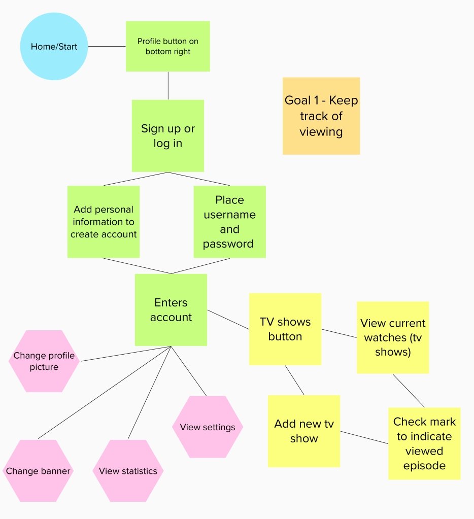
The first goal that was initially thought of in the first part of the redesigning process was to keep track of one’s tv show viewing. The app TV Time, which I am redesigning, was originally created to simply be an app to keep track of what shows you were watching and what episode you were on to keep everything organized.
It is necessary for the user to create an account to keep the data in one place and once that is completed, the user can adjust the profile picture and banner to their desired colors and photos to make it unique to them. Then, they can begin adding their shows and record what point they are up to in episodes and seasons.
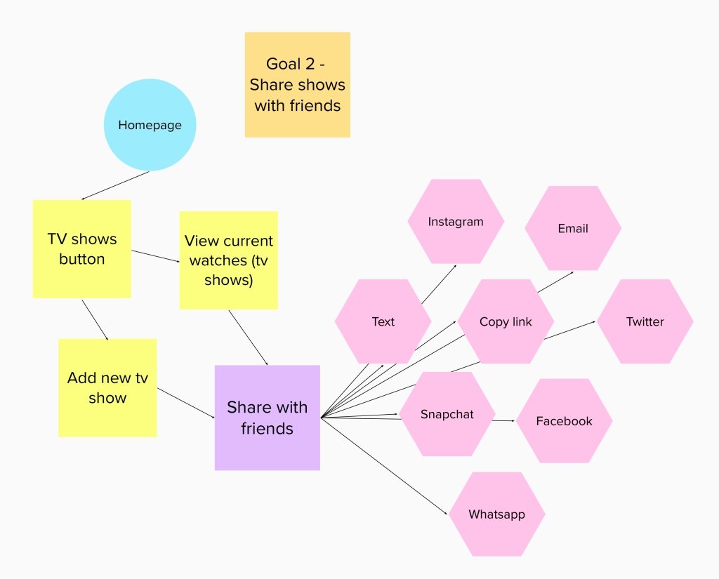
The second goal, which is necessary to have on any social media application nowadays, is to have the capability to share your shows and your progress with your friends and family. This process begins when you choose to update your tv show viewing status and add a new show, episode, or season to your progress.
When completed, the user has the option to share their information to their friends via a link, various social media applications as well as basic text and email.
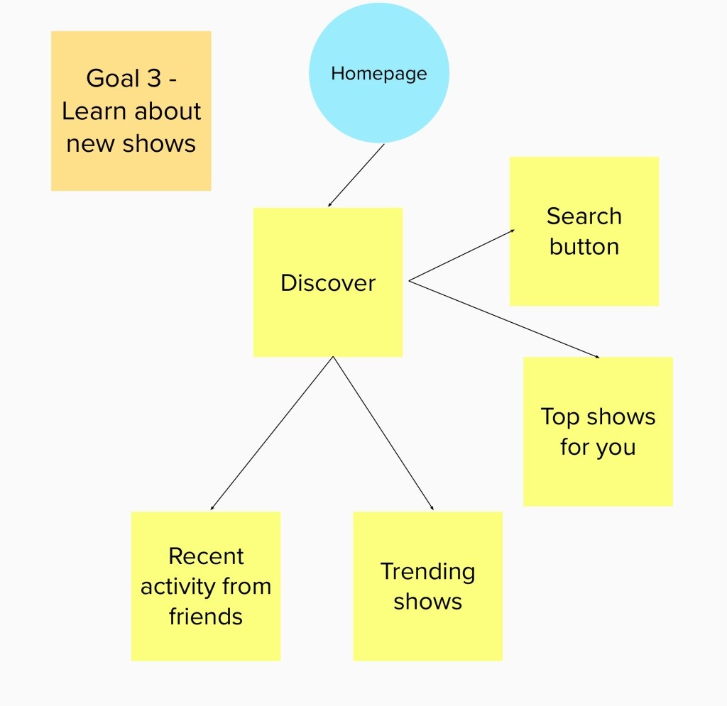
Once the user is comfortable with the interface and has inputted all of the television shows they are currently watching, they can use the discover button on the bottom menu bar to explore the other shows that may interest them as well as what their friends are watching, a basic search button, top-rated/trending shows and shows that are being recommended to you based on your viewing history.
In this current time in social media viewing, many of the applications have incorporated saved collections or bookmarked folders to keep one’s favorites organized for quick relocation at any point in time.
It’s important to include this feature on TV Time to organize our shows into categories that are recommended for us, such as crime shows, or categories that we labeled ourselves, like tv shows I watch with my friends, etc.
Similar to exploring the content unknown to the user stated in a previous goal as well as sharing the information with friends and family, another goal of the application is to have the ability to explore the community of fans of the specific show around the world.
Many people desire to meet people with similar interests, including favorite actors, shows, and fandoms to gain a sense of community, especially since this feature is offered in many other apps such as Instagram, Twitter, etc., where you can explore the world through a specific lens that interests a certain group of people.
This brings about a sense of community and friendliness that some people don’t have in their daily lives, which is crucial to maintain on an online platform such as this.
Information Architecture


When reviewing the application that I am redesigning, TV Time, I took notes on the variety of content that can be accessed and features that can be manipulated throughout the app. Several features of note are rating episodes, characters, etc., along with logging what you’ve recently watched as well as searching for new content to discover and organize and create lists of your favorite content and send what you’d like to your friends.
Along those same lines, the content that can be found in the application’s vast catalog should also be noted, such as shows and their networks, posters, and pictures related to the television shows and favorites along with the profile and FAQs.
Although these pieces of information may seem obvious, it’s important to note everything that can be accessed in the application, and nothing is too small in this part of the User interface and user experience process.
Escalating from the scope of TV Time, I delved deeper into how the information is structured and how it affects how the user interacts with it in any given scenario. As most applications begin, the user is greeted with the home page, which can lead them to several different options, such as your profile, the search/discover button as well as the movies and tv shows that one can further explore.
Each one of the four options leads to additional levels of exploration and discovery for the user that allows them to feel comfortable enough to spend a good amount of time logging in their viewing progress and sharing their data with their friends to prompt them to use the application.
It’s necessary to establish an easily navigable architecture that houses all the information needed to run the application for the designers as well as the users that expect the app to help their lives better, not causing more confusion in the end.
With these organizations of information, it allows for the designer to visualize how each scenario is going to play out through the detailed structure and scope of the application that the user already has in mind based on previous experiences and biases.
We as designers must make our time using the application as simple and fluid as possible and if not, we must use trial and error until the product is at its best.
Wireframe Designs


At this point in the process of redesigning that app, TV Time, I have captured and organized the necessary information to relay a cohesive site map that initially drove my rough wireframe designs.
Even before selecting how the user will interact with the application through tabs and buttons, a design must plan out the entire global navigation system. In short, that should show how the user can get from the home page as the base to any other page or tab in the application without any trouble.
All designers should include this piece of planning in their process to visualize how navigation will be followed through any number of paths.
As it is important to thoroughly design the visual aspects of the application, it is just as crucial to plan out the bones of the app, or the content that will be filling the pages and informing the consumer in the end.
Once all the arrangements of the information were completed and I felt confident to begin designing the first stage of the wireframes. The first stage of wireframes I created was relatively simple, with basic lines and symbols to indicate photos and videos that would soon fill the space in the final design. Only a handful of skeleton screens were designed for the draft of wireframes before user tests were initially conducted.
The first user testing session I initiated was with users between the ages of 50 and 60, to assess the basic accessibility of the application and design errors that I might have overlooked. In this first session, I was informed that my type was not as legible as it could be as well as the button size was on the smaller side, and was hard to see where to press without any of the colors and drop shadow effects being incorporated.
I didn’t want to use my color scheme and visual design elements as a crutch to create a sleek visually appealing application, because if the interactive aspect of the design didn’t function properly and couldn’t be accessed successfully by all levels of ability, it wouldn’t be considered a successful redesign in my eyes or in the eyes of anyone interacting with the application and wanted to use it to its fullest potential.
Once the final, or one of the final wireframe designs is completed, I will begin user testing among a larger range of ages and abilities to further create the best design for tracking one’s tv show viewing activity and wrap all the elements I’ve created throughout the entire ideation and design process together.
Semi-final Designs

From how the wireframes and testing were received by users, I have made my way to completing the semi-final designs that I will be using to conduct my final testing before having the app on display for any person to access as well as view through a walk through video.
With these almost final designs, initial prototyping is almost complete with the use of my previous knowledge of creating a webpage accessed through a mobile web app. I have used the typeface and color studies to create a cohesive design that can be seen on these various screens.
Final Designs & Results
The link below gives the users an example of how the application has changed through the entire design process and how it functions with Figma at the current moment, with room for improvement, of course.
The video tests out the basic functions needed to allow the application to be used by any user to complete the necessary goals as I stated them throughout the process.
While Figma was not as easy as other site staging platforms, it offered me the opportunity to work more efficiently. In return, I developed more prototyping, UX, and animation skills. While the app may not be functional, the project itself was a personal challenge that has been very rewarding.