
Microsite Design
Microsites are the new say in web development. A microsite is a smaller-scale site that may consist of any number of pages but is focused on one specific niche or topic. Not to confuse with a landing page, which is only one page, microsites may include as many pages as required for a specific purpose. Microsites are also called “independent campaigns”, “branded blogs”, and “communication platforms”.
Microsite Design Testing & Walk Through
Problem Solving & Ideation
The direction of this project was to design a microsite for users to interact with on mobile as well as desktop using the Adobe program XD. The program was new to me since I had been creating single-page websites with CSS and HTML, which was a learning curve in itself. This allowed me to gain new knowledge of the technology right at my fingertips. I used tutorials from Adobe.com and Youtube to understand the software further to create the most detailed microsite.
This project and event didn’t exist before I ideated it from listening to an episode of the podcast, “The Clinch”, titled, “99% Invisible”. The episode discussed the environment in space and how it’s being impacted by the debris and trash being discarded there affecting the ecosystem and our atmosphere.
I needed to incorporate the topic of the episode with an event that didn’t exist at the current moment, thus the Debris Debacle was created. The Debris Debacle is a conference dedicated to saving the environment, attending panels led by professionals in the space and atmospheric environment fields while meeting Sci-Fi actors through autographs and photo-ops.
Design Process

When I had a solid handle on what the Debris Debacle Convention would be consisting of event-wise, I knew I needed to draw the layout of how I envisioned the microsite's interface to be designed.
This design of the information architecture was mapped out using Mural, an online whiteboard website. The online application allowed me to color-coordinate my ideas and organize the content on main and sub-pages that would eventually be fully fleshed out and designed along with the prototyping.
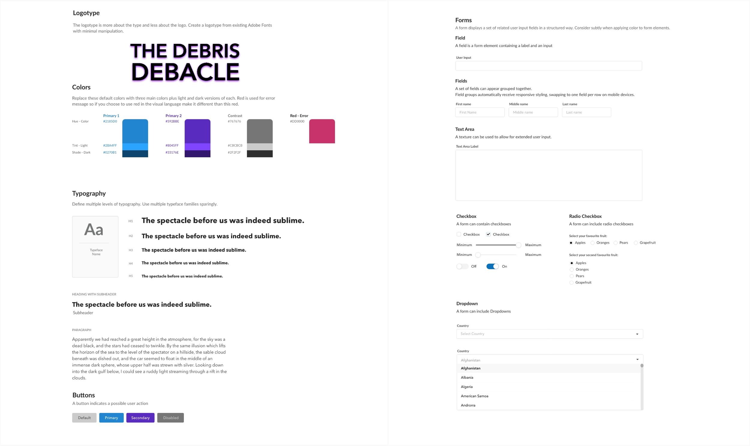
Once I received feedback from other designers on how to improve my navigation and layout as a whole, I implemented the recommendations and moved on to create an initial logotype, along with color and type studies.
Initial Wireframes

The next step in the design process was to design wireframes for the home page, guests page, and prices/tickets page. After having several peers review the wireframes, I realized that separating the guests from celebrities was in everyone’s best interest. This choice made much sense because their professions are spanning from environmental researcher to actor.
These mockups were roughly created in XD to indicate where photos and large boxes of type would eventually be placed in the final design. Seeing these visuals laid out like this allowed me to understand what problems were at eye level as well as below the surface at the user interface level.
Comp Wireframes

The overall design was coming together once the logotype and photos were added to the wireframes, as well as a textured background and color scheme additions. I was informed by my professor, that the grey background used throughout the site allowed it to resemble an unfinished wireframe mockup and not an almost finished microsite.
I took this advice to heart and immediately came up with a solution to the problem addressed. I was afraid of incorporating bold and flashy colors in my design because I hadn’t done much of that kind of work before, but I wanted to mimic the notable aesthetic of space that is often used in pop culture and the media.
Once I curated a desktop design for the microsite that I felt proud of, I had to transfer the information into a mobile design. I had to rethink how I was going to display and incorporate the many elements that could be seen in the desktop version. Every designer knows that designing a webpage that’s being used on a desktop is going to be very different from a webpage accessed on a phone or tablet.
Both interfaces needed to be branded and recognized as a pair, so that consumers wouldn’t be put off or confused. New buttons and interactions had to be made, especially since the browser would be used differently, no hovering buttons, no automatic sliding, etc.
Final Designs & Results


With the feedback I received throughout this entire process, I incorporated everything I was given into the final designs seen on the left here. This was a difficult project due to my initial lack of knowledge, but I persevered and created one of my favorite projects to date.
All the elements came together to create a recognizable brand identity and allowed the idea from the “The Clinch” podcast to be the main component of the design and make a compelling event a reality, to a certain capacity.