Initial Information Architecture
When diving into the initial organization of the application information, I took the advice and knowledge that Jesse James Garrett explains throughout his book, "The Elements of the User Experience", specifically in chapters four and five. Garrett suggests from the get-go that “With a clear sense of what we want and what our users want, we can figure out how to satisfy all those strategic objectives. Strategy becomes scope when you translate user needs and product objectives into specific requirements for what the content and functionality the product will offer to users” (57).
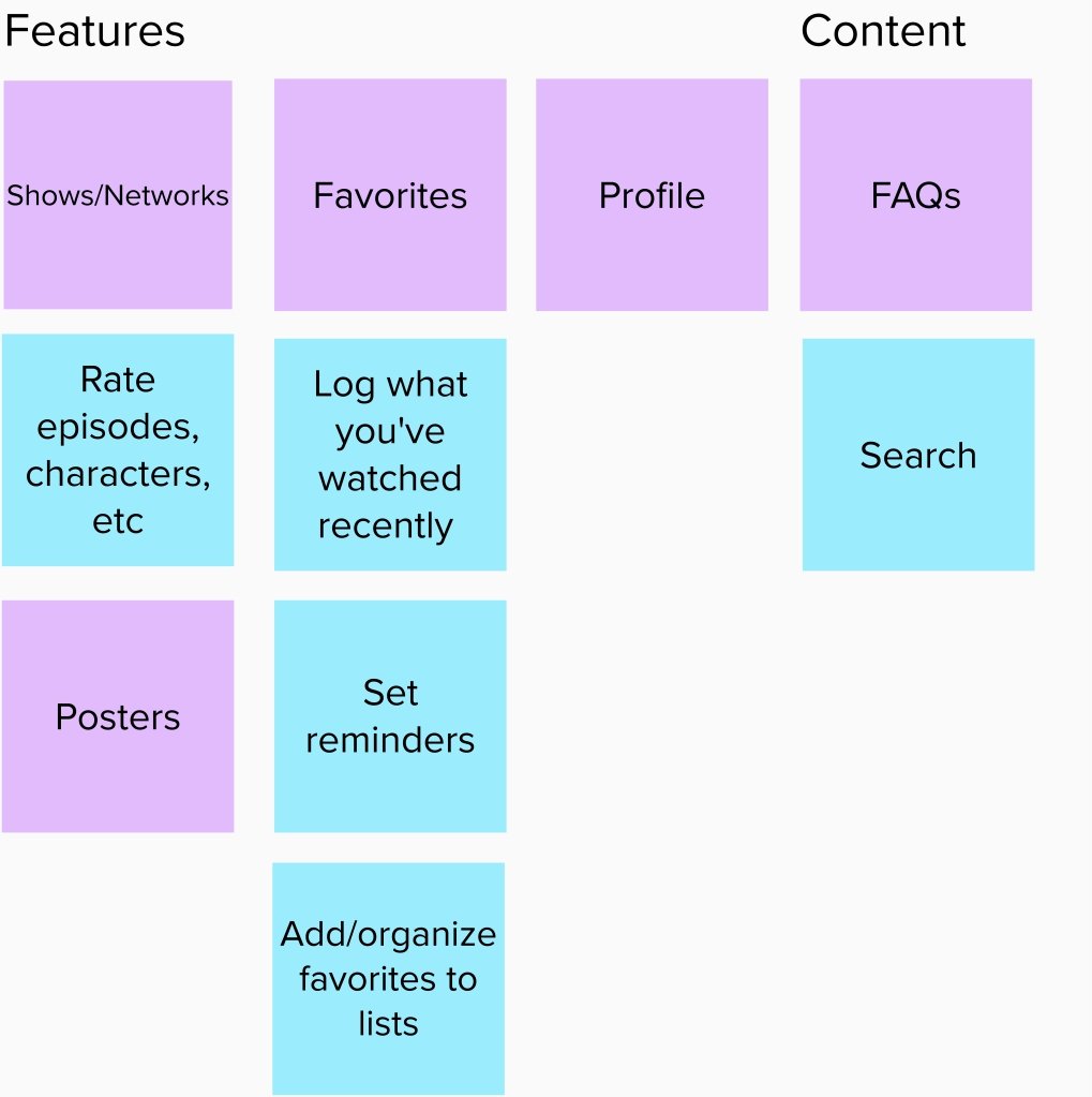
When reviewing the application that I am redesigning, TV Time, I took notes on the variety of content that can be accessed and features that can be manipulated throughout the app. Several features of note are rating episodes, characters, etc., along with logging what you’ve recently watched as well as searching for new content to discover and organize and create lists of your favorite content and send what you’d like to your friends.
Along those same lines, the content that can be found in the application’s vast catalog should also be noted, such as shows and their networks, posters, and pictures related to the television shows and favorites along with the profile and FAQs. Although these pieces of information may seem obvious, it’s important to note everything that can be accessed in the application, and nothing is too small in this part of the User interface and user experience process.
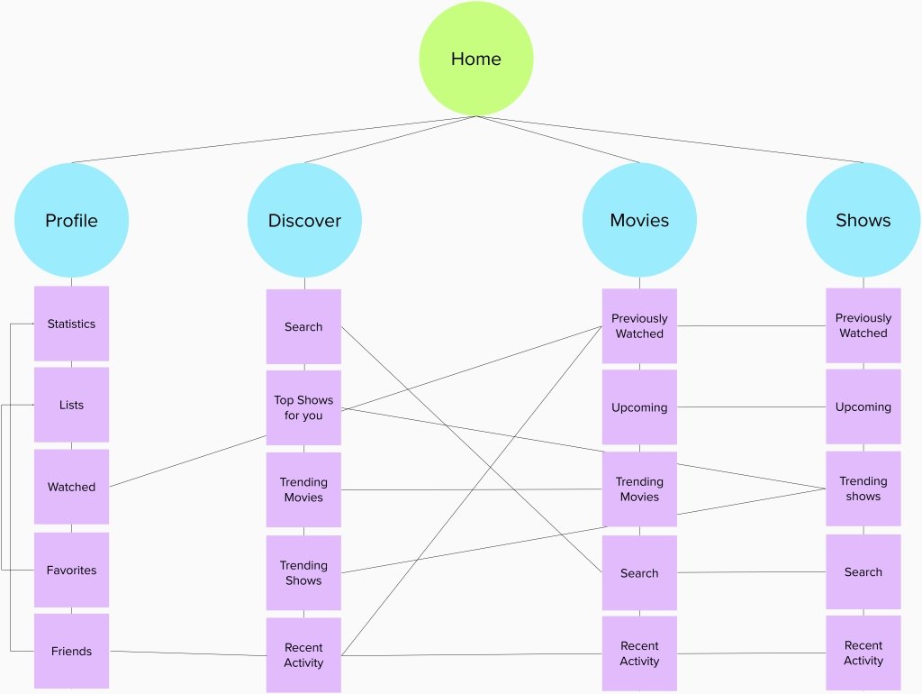
Escalating from the scope of TV Time, I delved deeper into how the information is structured and how it affects how the user interacts with it in any given scenario. Garrett explains further in chapter five, “After the requirements have been defined and prioritized, we have a clear picture of what will be included in the final product” (79). As most applications begin, the user is greeted with the home page, which can lead them to several different options, such as your profile, the search/discover button as well as the movies and tv shows that one can further explore.
Each one of the four options leads to additional levels of exploration and discovery for the user that allows them to feel comfortable enough to spend a good amount of time logging in their viewing progress and sharing their data with their friends to prompt them to use the application. It’s necessary to establish an easily navigable architecture that houses all the information needed to run the application for the designers as well as the users that expect the app to help their lives better, not causing more confusion in the end.
With these organizations of information, it allows for the designer to visualize how each scenario is going to play out through the detailed structure and scope of the application that the user already has in mind based on previous experiences and biases. We as designers must make their time using our application as simple and fluid as possible and if not, we must use trial and error until the product is at its best.

