
Seeing Through Type

Typography and personalized hand lettering have been around since the dawn of time when cave paintings were one of the only tools for communication. Now in the 21st century, designers can take inspiration from old typefaces of centuries before us and create something new by hand and by the use of technology.
Even though having inspiration can take us very far as designers, it’s important to understand how typography works and how to manipulate it effectively for the audience you are trying to reach. Joshua Johnson of DesignShack.net states in his article, “Eight Rules for Creating Effective Typography”, “The reason is that there is a major disconnect between the visual personality of the font selections and the words written with them…We have become accustomed to seeing different types of fonts used for certain purposes. Every font communicates certain attributes on both a conscious and subconscious level. Two of the major areas of communication are gender and era.”
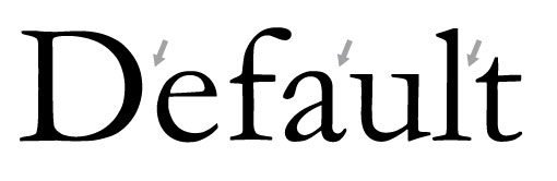
Credit to DesignShack.net
As human beings as well as designers, we naturally place associations on items and things that are attached for long periods by societal norms and perceived opinions of the masses. People neglect to realize that typography is all around us, even if they don’t think they directly interact with it. We all use typography when writing emails, seeing advertisements, reading menus, and accessing the internet.
The sooner everyone accepts that they can make choices regarding typefaces and create new works of typography, the better for the world as a whole because regardless of a person’s career field, they cannot escape the fact that they use typography in their work.
As the technology around us begins to change, we must learn to adapt and create around it to remain relevant in today’s industries. Typography is being tailored to fit into the application and UX/UI design that in decades previously was, unfortunately, an afterthought. A typeface can set your brand apart and enforce the tone you want to exude with any product.

Carrie Cousins, also of DesignShack.net, elaborates in-depth on, “Responsive typography will adjust so that text elements also change size and scale on websites. While that’s the technical answer, there’s also a greater design approach that is equally important, because just changing the size of a text element isn’t always enough,” in her article, “The 2022 Guide to Responsive Typography Sizing and Scales”.
In this time of the mass sharing of information, mainly on digital platforms, designers need to keep their users in mind when creating the interface, they will be sharing; they are the main target in the grand scheme of things, and they oftentimes get overlooked based on decisions of aesthetic and appearance overall.
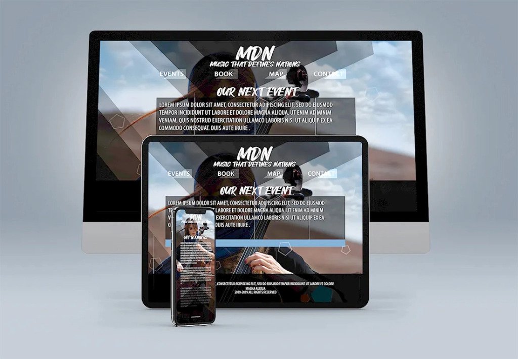
Credit to DesignShack.net
It is important to keep in mind how the information can and will be translated between devices and what will be needed to help the user access it. Not everything is as simple as changing the size of the typeface, in certain situations, the majority of the design and typography may need to be adjusted and changed to provide a certain level of effectiveness to the user.
Despite what several designers say, the user and their experience must be placed first and foremost over the designer’s personal feelings of appearance. The effectiveness of the work that is produced including the typography, hierarchy, and visual content is always trumped by how the user experiences the flow of information and how it is presented, causing the designer to need to step back and think about how the type and overall elements will come across to any user, depending on the device.