
Final Decisions


After receiving an immense amount of constructive feedback from my fellow designers, I now know potential consumers and what they’d like to see in the brand identity. With this in mind, I planned the necessary changes and modifications to the initial brand design to move closer to the final product.
Out of the three first mockups of the brand identity of TV Time, the consensus was that the favorite logotype was the second version, which was designed based on a combination of vintage typefaces from the early age of golden television and popular sleek modern typefaces that are currently devouring the application and design industry in general. This specific typeface will be included in the brand logo as well as the headings and larger textual items that are easily legible from far distances since All-Round Gothic is not a commonly used typeface.
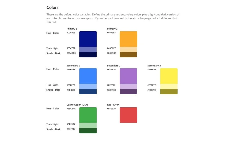
For the corresponding color scheme, I received a multitude of varying opinions but, in the end, I wanted to expand the variety of the palette, especially because the app tracks television viewing and is inspired by the early age of television for the overall aesthetic. In the early stage, I included several colors on the cooler side of the spectrum but was guided by my peers to include other colors on the warmer side that I had included in different versions to contrast the color scheme as a whole for the end brand design.
The choice of body type was a topic of discussion for the majority of the meeting session. For the original second version of the mockup, I continued to use All-Round Gothic for the body type as well. Unfortunately, it was decided unanimously that it wasn’t quite as legible in a smaller point font and would take away from the overall message and branding identity that I was attempting to convey through this extensive process. I decided to switch the body type to another one of my typeface choices in the mockup stage, which was PingFang HK, which provides a slender, more modern style to contrast the vintage look of the heading typeface.
Stepping away from the typeface and textual elements, I knew I needed to make changes on my buttons regarding color choices and shading. I needed to choose the buttons designed in the styles I incorporated in the second and third versions of the mockups that were favored by my peers over the first version which included too many variations in color and hue, which became confusing for them as potential users.
Of the button symbols, the style shown in the second mockup version was favored out of all three of the designs. The first and third symbol designs were at the ends of several extremes and could potentially only be functionally used when combined to create a new style, which was the product displayed in the second mockup. The symbols allow the outlines to be seen since they are not as razor-thin as the third mockup as well as not as bold and blinding as the first mockup that incorporates the style of 70s and 80s vintage televisions and their corresponding programs at the time.
The tone of voice that was mainly preferred was that of friendliness and informality since the application is about tracking television shows and sharing that information with friends. The selected tone of voice for the written language used throughout the application uses relevant and up-to-date language that anyone can understand in comparison to outdated lingo used in previous mockups and extremely formal robotic-sounding tone that leaves out the warm and fuzzy environment that we are attempting to reinforce.